

Tab Button Styles (Active & Hover Effects)
Make your tabbed content clearer and more interactive with the Active and Hover Effects feature in the Easy Tabs Block plugin for WordPress. These effects help users easily see which tab is active and which one they’re hovering over.
Different Tab Effects
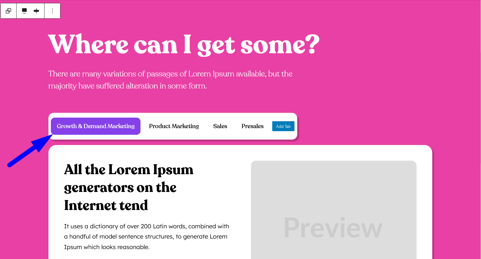
- Active Effect: The style that highlights the currently selected tab so users know which content they’re viewing.
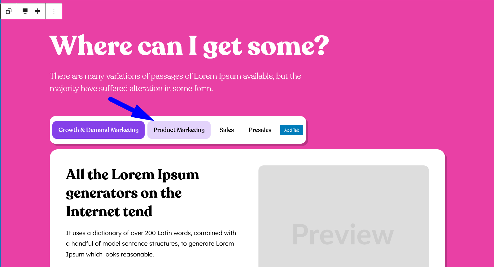
- Hover Effect: The style that appears when a user hovers over a tab, giving quick feedback and making the tabs more interactive.
How to Configure the Active and Hover Effects
Follow these simple steps to customize your tab button styles:
- Add the Easy Tabs Block:
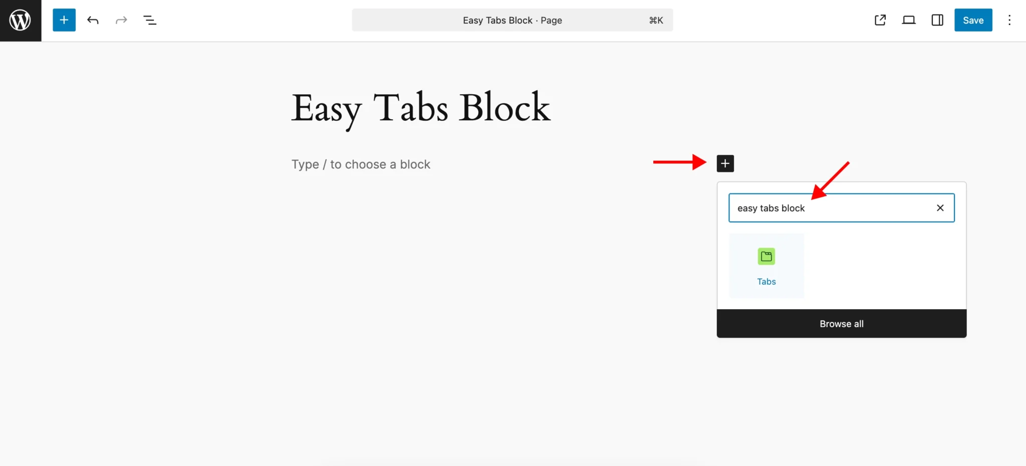
Go to the WordPress editor. Click the “+” button, search for “Easy Tabs Block,” and select it to add it to your page.
- Open Style Settings:
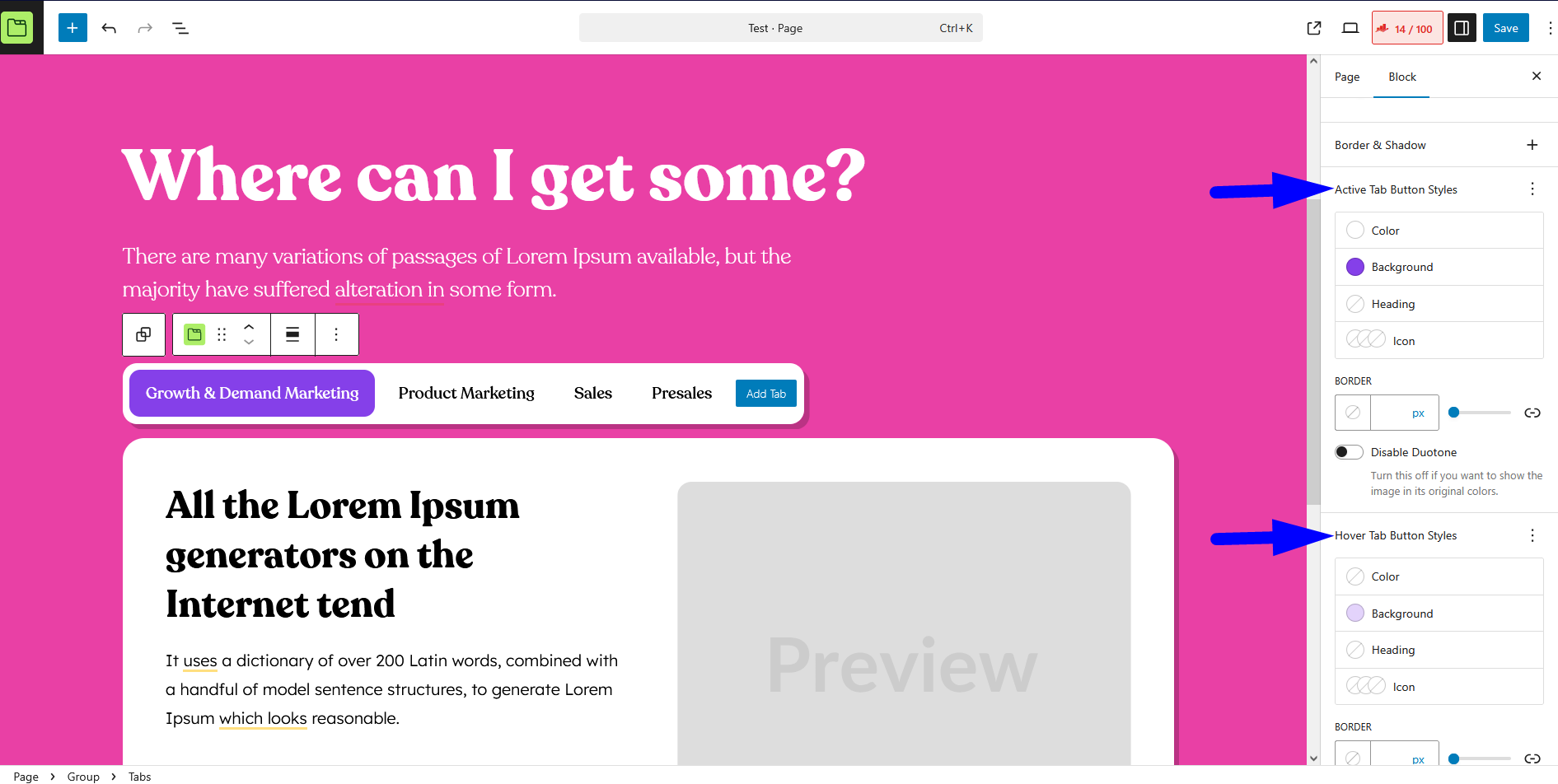
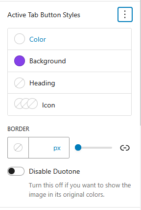
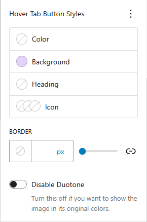
Click on the Tabs Block you just added. In the sidebar settings, open the “Block Styles” tab, then scroll down to find “Active Tab Button Styles” or “Hover Tab Button Styles.”
- Active Tab Customization:
Click on the “Active Tab” option and adjust the settings as needed. Select a clear, contrasting text color and choose a distinctive background color to make the active tab stand out.
You can also customize the border by adjusting its thickness, style, and color.
Additionally, you have the option to modify the appearance of icons, including their fill and stroke colors, to match your design.
- Hover Tab Customization:
Select the “Hover Tab” option and configure the settings. Choose a text color that changes when users hover, and set a noticeable but subtle background color for the hover state.
You can also customize the border’s appearance during hover and adjust how icons respond to the hover effect.
Test your changes directly in the Gutenberg editor by interacting with the tabs.
Recommended Best Practices
- Use clearly distinct colors for active and hover effects to avoid user confusion.
- Keep hover effects subtle enough to provide feedback without overwhelming the design.
- Maintain consistent styling between Active and Hover states for a cohesive visual experience.
By applying these Active and Hover effects, you’ll make your tabs intuitive, engaging, and user-friendly.