How to Use Scroll-Synced Sticky Tabs
Keep your tab navigation in view and in sync with content as users scroll. When enabled, the tab buttons stick to the top of their container, and the active tab highlights automatically based on the visible content section.
Who Should Use This
- Long-form Content: FAQs, tutorials, or documentation with multiple sections.
- Step-by-Step Guides: Keeps track of progress as readers scroll.
- Feature Overviews: Ensures users always see which feature they’re reading about.
Prerequisites
- Easy Tabs Block Pro activated
- A Tabs block with at least two tab buttons and corresponding content panels
Activating the Sticky & Scroll-Based Tabs
Select Your Tabs Block . In the Gutenberg editor, click on the Tabs block to reveal its settings. Open the “Sticky with Scrollable” Panel and then in the block inspector sidebar, select and expand Sticky with Scrollable.
Switch Enable Sticky and Scrollable to On.
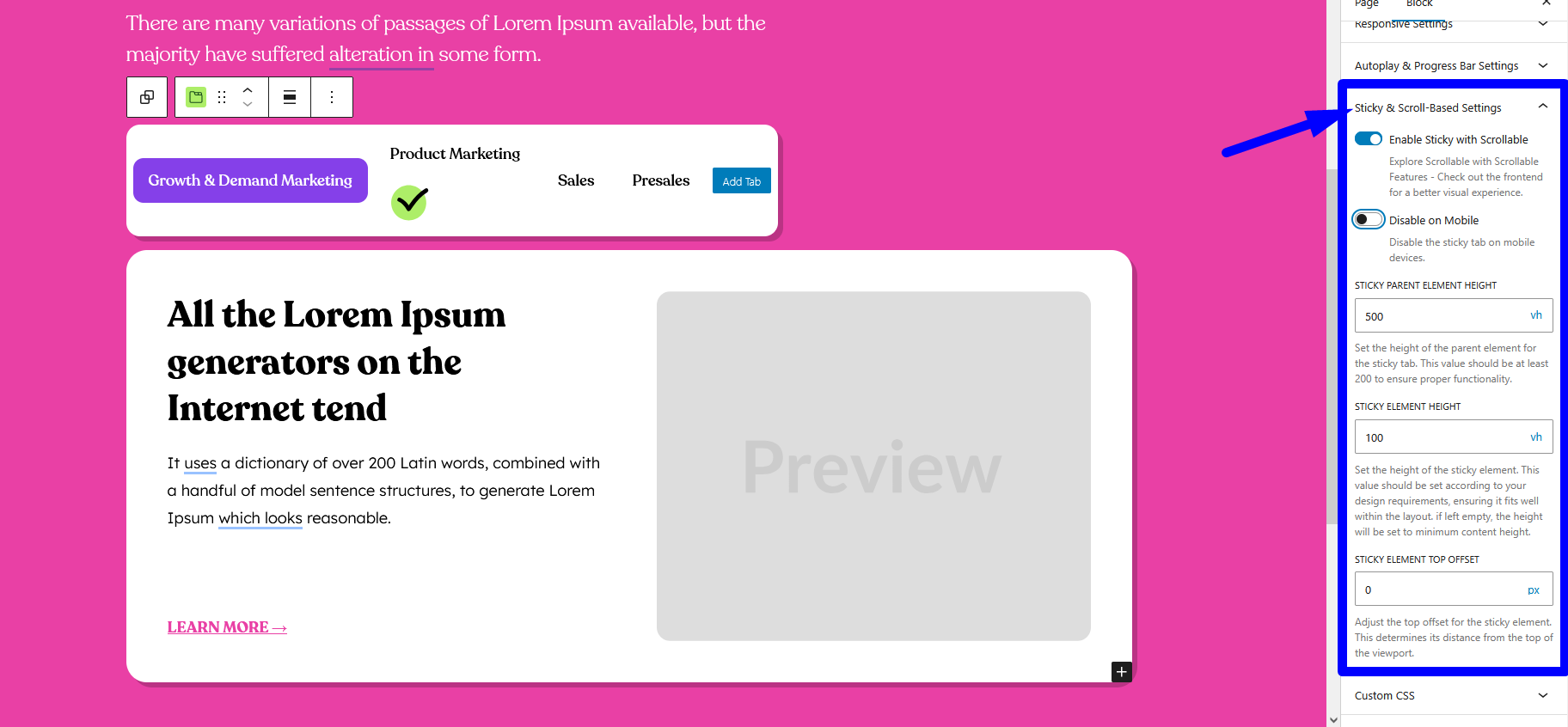
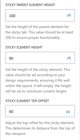
Panel Settings
Sticky Parent Element Height: Minimum height of the tabs container to trigger sticky behavior. Must be at least 200 vh.
Sticky Element Height: Height of the sticky tab button wrapper. Adjust to match your button styling and padding.
Example: 80 vh
Sticky Element Top Offset: Distance from the top of the viewport before the tabs stick. Handy for avoiding overlap with fixed headers or admin bars.
Tip: If you have an admin bar or fixed header, set Top Offset equal to its height.
How It Works
Sticky Activation: When you scroll past the top of the tab buttons wrapper, it becomes fixed at your Top Offset.
Scroll Tracking: As each content panel scrolls into view, its corresponding tab button gains the active state.
Responsive Behavior: On narrow screens, tab buttons remain horizontally scrollable. If overflow isn’t needed, they wrap to multiple lines.
With Sticky & Scroll-Based Tabs, your readers enjoy seamless navigation and clear context, even on the longest pages.