

How to Expand Tabs (Collapsible Tab)
The Tab Expander feature allows you to add collapsible content directly within a tab button. When a tab is active, its expander panel opens to reveal extra details or summaries, while inactive tabs keep their expanders hidden.
This helps keep your layout clean and compact, letting users explore more information only when they choose.
Who Should Use This
FAQ Pages: Show brief questions and expand answers on demand
Product Teasers: Display a short title, then reveal specs or pricing
Mobile Views: Keep buttons concise, expanding content only when needed
Prerequisites
Easy Tabs Block Pro activated
A Tabs block with at least one Tab Expander added to each Tab Button
How to Add a Tab Expander
In the Gutenberg editor, either insert a new Tab Button or select an existing one where you want to add expandable content.
Inside the Tab Button, click the + icon to add a new block, then choose the Tab Expander block (also known as a Collapsible Tab) to create a section that users can expand or collapse as needed.
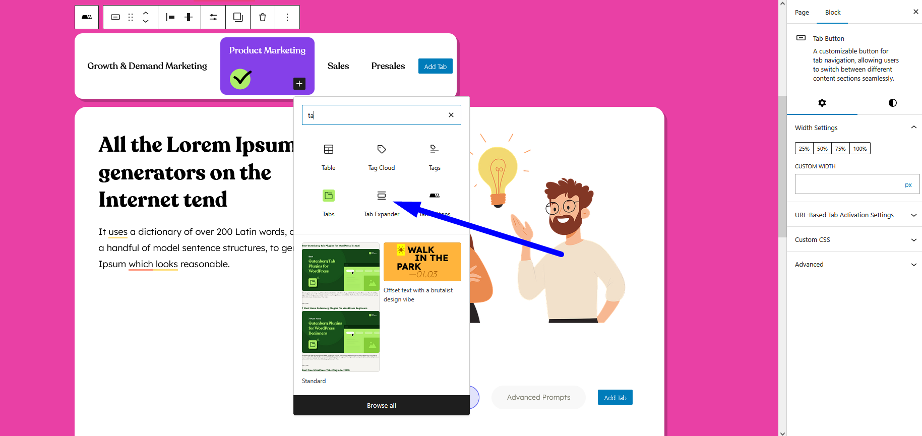
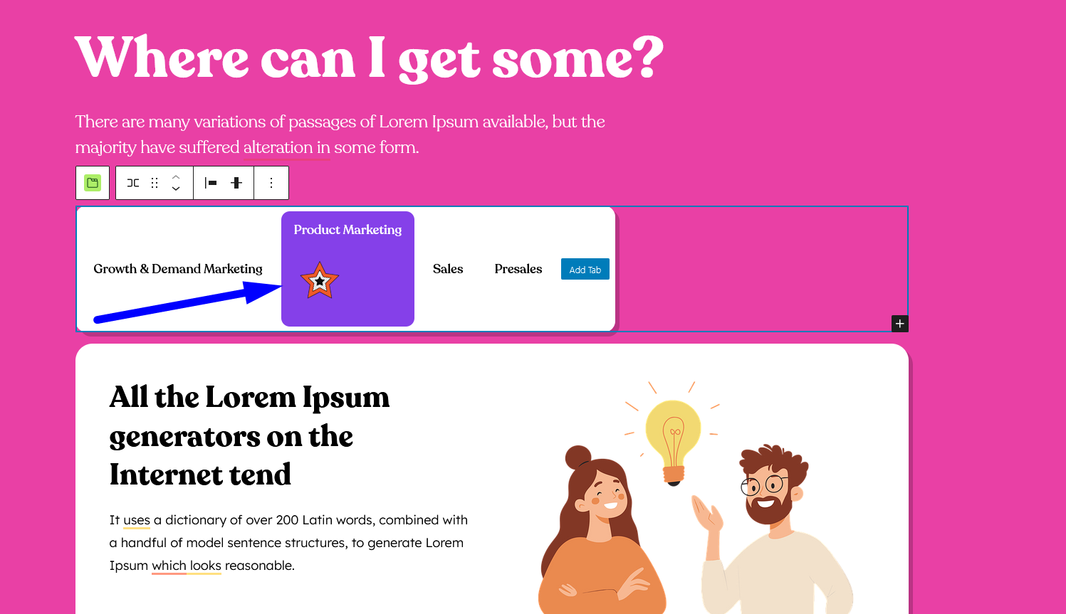
Inside the Tab Expander, you can add any Gutenberg blocks such as text, images, lists, or shortcodes to display your content.
Repeat this process for other tab buttons by adding expanders wherever needed to organize your information in a clean, collapsible layout.
Expander Settings
- Responsive Visibility
Control where the expander appears:- Hide on Desktop
- Hide on Tablet
- Hide on Mobile
How It Works
When a Tab Button with an expander is active, the inner expander section smoothly slides open to reveal its content.
Only the expander for the active tab remains visible at a time—switching to another tab automatically collapses the previous one, keeping the interface clean and focused.
With the Tab Expander, you can present concise tab buttons while still offering rich, on-demand content—perfect for clean, interactive layouts.