

The general rule of thumb while designing a website page is “Keep it Short and Simple”. But with the decreasing attention span, you want users to get as much information as possible from a single page.
However, long pages are not the problem. Poor structure is.
Many WordPress websites have detailed guides, product descriptions, or landing pages that need space. There is nothing wrong with that. In fact, long-form content often performs better in search results and builds more trust.
But when a page becomes a wall of text, people stop reading. They scroll quickly. They skip sections. Sometimes they leave.
The good news is this: you do not need to delete content to fix the problem. You just need to organize it better.
In this article, we will explore simple, practical ways to make long pages easier to read in WordPress without removing important information.
Why Long Pages Feel Overwhelming
Most long pages do not feel overwhelming because of their length alone. They feel overwhelmed because of how the content is presented.
Imagine opening a page and seeing one huge block of text.
→ No clear sections.
→ No spacing.
→ No visual breaks.
Your brain immediately tells you, “This will take too much effort.”
That reaction is natural. Here are a few common reasons long pages feel difficult to read:
- Large text blocks: When paragraphs are too long, readers lose their place. It becomes harder to scan.
- No clear structure: If headings are missing or unclear, visitors do not know where one topic ends and another begins.
- Too much information at once: When everything is visible at once, the page feels crowded.
- Poor spacing: If sections are too close together, the page feels heavy, even if the content is good.
Think about a well-organized book. Even if it has 300 pages, it does not feel overwhelming because it is divided into chapters, sections, and clear headings.
Your WordPress page should work the same way. The goal is not to make the page shorter. The goal is to make it easier to navigate.
8+ Ways to Make Long Pages Easier to Read in WordPress
Long pages are great for detailed content, but they can feel overwhelming if everything looks crowded or hard to scan. The good news is you don’t need to cut your content; you just need to organize it better.
Below are simple, practical ways to make long pages easier to read in WordPress.
1. Break Content into Clear Sections
One of the simplest ways to make long pages easier to read in WordPress is to divide them into clear sections.
When everything is grouped into one continuous flow, readers feel lost. But when content is divided into focused sections, it becomes easier to scan and understand.
Each main topic should have its own heading.
For example, if you are writing a long guide about email marketing, your sections might look like this:
- What Is Email Marketing
- Why It Matters
- Tools You Can Use
- Step-by-Step Setup
- Common Mistakes
Each section covers one idea. Nothing more.
In WordPress, this is easy to do using heading blocks. Use:
- H2 for major sections
- H3 for subtopics
- H4 only if truly needed
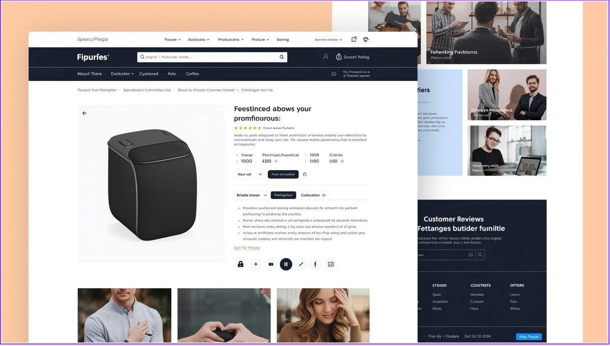
This creates a clear visual hierarchy. If you run a WooCommerce store and have a long product page, you can separate it into sections like:
- Product Overview
- Key Features
- Technical Specifications
- Customer Reviews
- FAQs
Instead of stacking everything into one long scroll, visitors can quickly jump to the section they care about.
2. Keep Paragraphs Short and Scannable
Long paragraphs are one of the biggest reasons pages feel heavy. Even if your ideas are clear, a paragraph that runs for 8 or 10 lines can feel intimidating. Most readers will skip it.
Short paragraphs are easier to process. They give the eyes space to rest. They also make scanning much faster.
A good rule in WordPress is to keep paragraphs between 2 to 4 sentences. If a paragraph starts to feel dense, break it. For example, instead of writing one long explanation about a feature, split it like this:
First, explain the idea in simple terms. Then, use a short paragraph to give an example. If needed, add another short paragraph with a tip.
This small change makes a big difference.
In the WordPress editor, spacing matters too. Use white space intentionally. Do not press everything tightly together. Let the content breathe.
When paragraphs are short and spaced properly, even a 2,000-word page can feel light and readable.
3. Use Bullet Points and Lists
When a page is long, readers look for anchors. They look for shapes and patterns that break the text.
Bullet points and lists do exactly that.
Instead of hiding important details inside long paragraphs, pull them out and display them clearly.
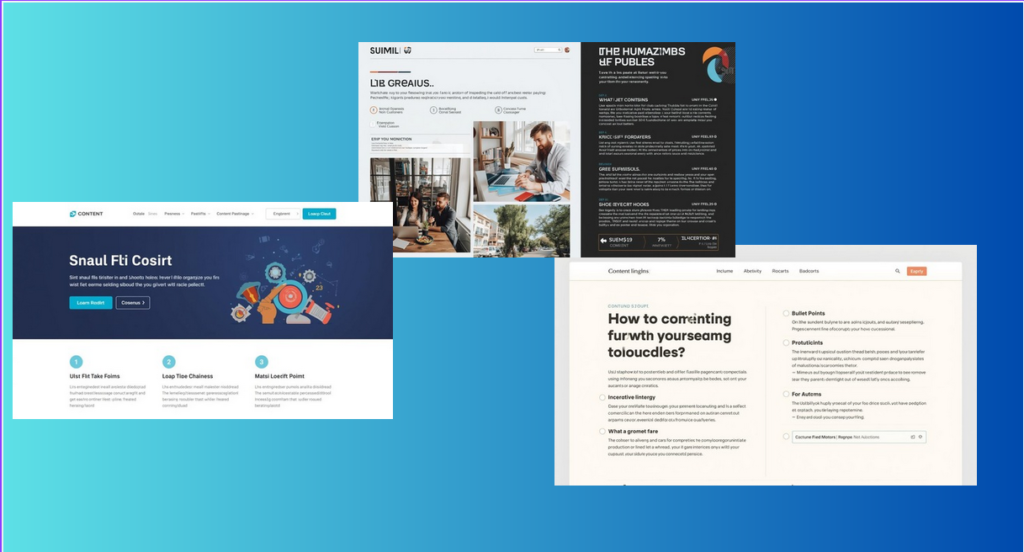
For example, instead of writing:
“Our plugin includes responsive design, customizable layouts, easy integration, and mobile compatibility.”
You can write:
Our plugin includes:
- Responsive design
- Customizable layouts
- Easy integration
- Mobile compatibility
Now the information is easier to scan. The reader understands it in seconds.
Lists work especially well for:
- Features
- Benefits
- Steps
- Requirements
- Comparisons
- Key takeaways
Bullet points reduce visual fatigue. They create rhythm on the page. They also guide the eye naturally.
Used correctly, they make long pages easier to read without removing any content.
4. Add Visual Breaks (Images, Icons, Dividers)
Even a well-written text can feel heavy if it runs too long without interruption. Visual breaks give the reader a pause. They make the page feel lighter and more organized.
A visual break does not have to be complicated. It can be:
- An image
- A simple icon
- A horizontal divider line
- A highlighted quote
- A small graphic
For example, if you are writing a long guide, you can insert a relevant image after every 3–4 sections. This resets the reader’s attention and makes scrolling feel easier.
If you are explaining a process, you can add small icons next to each step. This creates structure and helps readers follow along.
On a long WordPress tutorial page, you might:
- Add a screenshot when explaining a setting
- Insert a divider between major sections
- Use a callout box for important tips
These small design choices improve readability without changing the content itself.
5. Use Tabs to Organize Related Information
Sometimes a page has too much content to show all at once. This is where tabs can help. Tabs let you group related sections without making the page feel overwhelming.
For example:
- On a product page, you can have tabs for Features, Pricing, Customer Reviews, and FAQs instead of stacking all content vertically.
- On a tutorial or guide, you can separate Step-by-Step Instructions, Examples, and Tips into different tabs.
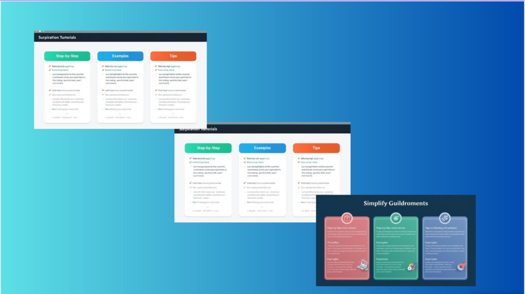
Imagine a WordPress page with a long tutorial. Instead of scrolling through 3,000 words, the reader can click on tabs for each major section. This keeps the page organized and easy to navigate.
In WordPress, tools like Easy Tabs Block make this simple. You can create responsive tabs directly in the block editor, group content naturally, and ensure it works on both desktop and mobile. This way, long pages stay readable without cutting content.
Tabs also improve user experience because readers can focus on the section they care about and skip what they don’t need.
6. Use Accordion Sections for FAQs or Extra Details
Accordion sections are similar to tabs but work vertically. They hide content until the reader clicks to expand it. This is perfect for FAQs or extra details that not every visitor needs to see immediately.
For example:
- On a long tutorial, you can hide optional tips or extra examples in an accordion.
- On a product page, you can place detailed specifications or troubleshooting steps inside an accordion under each main section.
Accordions work well with WordPress block tools, and plugins like Easy Tabs Block often include accordion features. This makes it simple to create collapsible sections without coding.
Using accordions improves readability, reduces scrolling fatigue, and gives readers control over what content they want to see.
7. Add a Table of Contents for Easy Navigation
A table of contents (TOC) is one of the simplest ways to make long pages easier to read in WordPress. It acts like a roadmap for your content, letting visitors jump straight to the section they need.
For example:
- On a long guide, the TOC can list all main sections with clickable links.
- On a product or tutorial page, readers can jump from Features to Pricing or FAQs without scrolling through the entire page.
Many WordPress plugins and block editor features allow you to automatically generate a TOC from your headings. This saves time and ensures accuracy.
A table of contents improves usability by giving readers control and reducing frustration. They can find exactly what they need quickly, even on very long pages.
8. Optimize for Mobile Reading
Most people browse websites on their phones or tablets. A page that looks great on a desktop can feel overwhelming or hard to read on a small screen. Optimizing for mobile makes long pages easier to read for everyone.
For example:
- Stack sections vertically so visitors don’t have to pinch or scroll horizontally.
- Make headings and buttons large enough to tap easily.
- Ensure images, tabs, and accordion sections adjust to smaller screens without breaking the layout.
On a WordPress landing page with tabs and accordions, a mobile visitor can scroll through a vertical layout and tap tabs to see each section. Plugins like Easy Tabs Block automatically make tabs responsive, so your content looks good on any device.
Optimizing for mobile reduces frustration, keeps visitors engaged, and makes long pages feel manageable on any device.
9. Maintain Consistent Formatting Across the Page
Consistency makes long pages easier to read because visitors know what to expect. When headings, spacing, and layout patterns are predictable, readers can focus on the content rather than on figuring out the structure.
For example:
- Keep heading sizes consistent across all sections. Use H2 for main sections and H3 for subtopics.
- Use the same font and text size for paragraphs throughout the page.
- Maintain uniform spacing between sections, images, and lists.
Consistency improves readability, creates a professional look, and makes navigating long pages less tiring for visitors.
FAQ(s) Making Long Pages Easier to Read in WordPress
Q1: Do I need to shorten my content to make long pages readable?
Not necessarily. You can keep all your content, but organize it better. Using headings, lists, tabs, and accordions can make a long page feel lighter without deleting anything.
Q2: How do I know if my page is too long or confusing?
A simple test is to ask someone unfamiliar with your content to quickly find information. If they struggle, your page might need a better structure. Analytics such as bounce rate and scroll depth can also reveal problem areas.
Q3: Are tabs and accordions good for user experience?
Yes. They reduce clutter by hiding less important content until the reader wants it. This keeps long pages readable and interactive.
Q4: What’s the easiest way to create tabs in WordPress?
Plugins like Easy Tabs Block let you create responsive tabs directly in the WordPress block editor. You can organize sections like Features, Pricing, or FAQs without coding.
Q5: Can a table of contents really help?
Absolutely. A clickable table of contents allows readers to jump to sections they care about, which is especially helpful on very long pages.
Conclusion
Long pages in WordPress don’t have to be overwhelming. The key is organization.
You can make your pages easier to read by organizing content into clear sections and keeping paragraphs short. Use bullet points and visual spacing to break up large blocks of text. When needed, group related information with tabs or accordions so visitors can find what they’re looking for quickly and comfortably.
Tools likeEasy Tabs Block make this especially simple, letting you create responsive, clickable sections without coding. Combined with a table of contents and mobile-friendly design, even very long pages can feel light and approachable.
Remember, the goal isn’t to shorten your content. Our main target is to help visitors find and understand it quickly. With the right structure, long pages become an advantage, not a barrier.
Join Our Insider List for Exclusive Updates & Pro Tips
Be the first to know about new releases, get expert tips, and access behind-the-scenes insights.
We respect your privacy. No spam. Unsubscribe anytime.