

Users visit a website not to stroll, but to find something specific. They might need information regarding your product or your service.
If they cannot find it easily, they leave.
Most websites do not fail because of bad content. They fail because the content is poorly organized. Everything is there, but it is hard to scan. Headings are unclear. Sections feel crowded. Important details are hidden inside long paragraphs.
Good content organization makes a website user-friendly. It helps visitors understand where to look and what to read. It reduces confusion and keeps people on the page longer.
In this article, we will go through practical best practices for organizing website content clearly and thoughtfully.
Best Practices for Organizing Website Content
Think about a clean desk compared to a messy one. The same items may be present on both. But on the clean desk, you can find what you need quickly. That is what content structure does for a website.
In this section, we’ll go through practical ways to structure your content so it is clear, helpful, and easy to use.
1. Start with Clear User Intent
Before you organize any content, think about what you want your visitors to do. Should they be looking for information, comparing options, or ready to take action?
For example:
- If you want your visitors looking for a product feature comparison to see a features table or a side-by-side list at the top.
- Someone reading a “how-to” guide might need a step-by-step layout, with short sections and clear headings.
- If a visitor wants quick answers to a question, a FAQ section at the top can save them time.
When you organize content around user intent, the page feels helpful instead of confusing. Visitors don’t have to guess where to look, and they can get what they need quickly.
A practical tip: check your analytics to see what pages people visit first and what they search for on your site. That will give you clues about their intent and how to structure the content.
2. Establish a Logical Content Hierarchy
Once you know what your visitors are looking for, the next step is arranging your content in a clear hierarchy. Think of it like an outline for a book. The most important topics should come first, and supporting details follow.
For example:
- Headings: Use H1 for the main page title, H2 for major sections, and H3 for subtopics. This makes it easier for readers to scan and understand the structure.
- Paragraphs: Keep them short, usually 2-4 sentences each, so readers don’t feel overwhelmed.
- Subsections: If you’re writing a guide, group related steps under their own headings, like “Step 1: Gather Materials” and “Step 2: Prepare Workspace.”
On an eCommerce site, your main H2 sections might be Product Details, Customer Reviews, and Related Products.
Then, under Product Details, H3 headings could break it down into Features, Specifications, and Warranty Info.
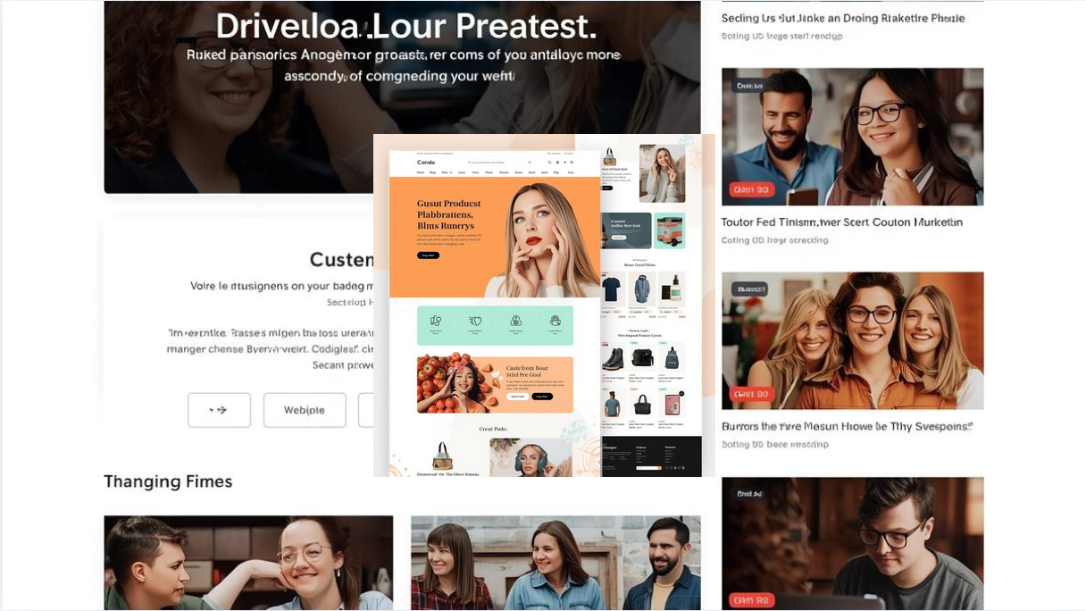
A clear hierarchy not only helps users but also improves accessibility. Screen readers and search engines can better understand your page, making it easier to navigate for everyone.
3. Group Related Information Together
After you set up a hierarchy, the next step is to group similar content in one place. This helps visitors find the information they need quickly, without scrolling back and forth on the page.
Like:
- On a product page, group features, specifications, and warranty together instead of scattering them across the page.
- For a blog or guide, put all related tips in one section, and all supporting examples or case studies in another.
- FAQs work well as a grouped section, so users can scan answers without reading the entire page.
Imagine a SaaS website. Instead of listing features at random, create sections like Core Features, Integrations, and Pricing. Each section has all the details a visitor might want about that topic.
Grouping content also reduces cognitive load. Visitors don’t have to remember bits of information from different parts of the page; they can focus on one topic at a time.
4. Use Tabs and Accordions to Reduce Visual Clutter
Sometimes a page has a lot of information, and showing it all at once can overwhelm visitors. This is where tabs or accordion sections come in handy. They let you hide secondary content until the user wants to see it, keeping the page clean and easy to read.
For example:
- On a product page, you can have separate tabs for Features, Specifications, Customer Reviews, and FAQs instead of stacking everything vertically.
- On a guide or tutorial, an accordion can hide extra tips or examples until the reader clicks to expand them.
A WordPress site explaining a SaaS tool might use tabs to separate Pricing Plans, Features, and Integrations. This keeps the page organized while letting visitors focus on the section they care about most.
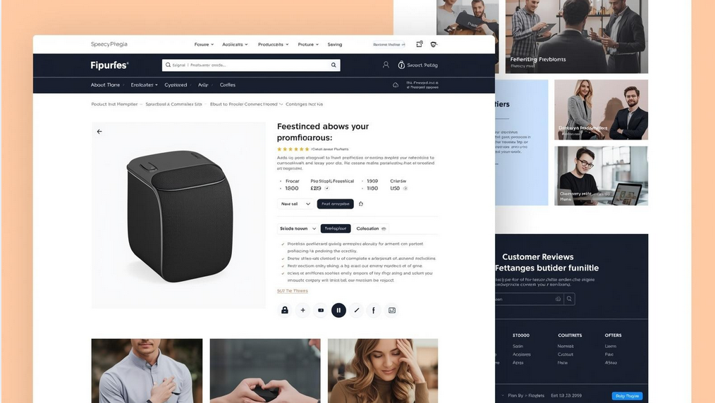
In WordPress, tools like the Easy Tabs Block make this really easy. You don’t need to write any code; you can create responsive tabs and accordion sections directly in the editor, keeping your content neat and user-friendly.
5. Apply Progressive Disclosure
Progressive disclosure means showing only the most important information first and revealing additional details only when the visitor wants them. This prevents overwhelming readers while still giving access to all the content they might need.
- On a FAQ page, show only the questions initially. When a visitor clicks a question, the answer expands below.
- In a tutorial, present the main steps first and hide optional tips or extra resources behind a “Read More” link.
- For product features, highlight key benefits and let users expand sections to view more technical details.
On an online course website, the course overview is displayed first, and each module’s lessons are revealed only when the user clicks to expand. This keeps the page tidy and easy to scan.
Using progressive disclosure improves the user experience by giving visitors a sense of control. They can focus on what matters to them and explore additional information only if they want it.
6. Design for Mobile-First Experience
More than half of web traffic comes from mobile devices. That means your content needs to be easy to read and navigate on smaller screens. Organizing your content with mobile users in mind is essential.
- Stack sections vertically so visitors don’t have to pinch or zoom to read.
- Use collapsible sections or tabs to hide less important content while keeping the page clean.
- Make buttons and links large enough to tap easily without mistakes.
Designing with mobile-first principles keeps your pages usable on any device. Visitors won’t have to struggle to find information, and they are more likely to stay and explore.
7. Maintain Consistency Across Pages
Consistency helps visitors feel comfortable on your site. When layouts, headings, and section patterns are similar across pages, people know where to look and can navigate more easily.
For example:
- If your product pages always have sections in the order Features → Pricing → Reviews → FAQs, visitors can quickly scan any product page without confusion.
- Blog posts might always start with an intro, followed by tips, and end with a summary. Readers will know what to expect each time.
- Using similar colors, fonts, and button styles across pages also reinforces familiarity.
Consistency reduces cognitive load and makes your website feel more professional and reliable, even without flashy design elements.
8. Balance SEO with User Experience
Organizing content isn’t just for your visitors. It also helps search engines understand your pages. But the goal is always to make the page easy for humans first, not just for SEO.
For example:
- Use headings that describe each section clearly. Visitors can scan them, and search engines understand the structure.
- Keep paragraphs short and readable. Avoid stuffing keywords unnaturally; instead, write naturally while including relevant terms.
- Make sure important content isn’t hidden in ways that confuse readers, even if it is still indexable by search engines.
On a product page, clearly labeled sections like Features, Pricing, and Customer Reviews make it easy for visitors to find information. At the same time, search engines can read and index these headings. This helps your page show up in relevant search results.
Balancing SEO and usability ensures your content reaches people and keeps them engaged once they arrive.
9. Use the Right Tools to Simplify Organization
Sometimes organizing content manually can be tricky, especially when you have many sections or pages. Using the right tools can make it easier to keep everything neat and user-friendly.
For example:
- WordPress block editor allows you to structure content visually with headings, columns, and sections.
- Layout or tab plugins can help you create interactive sections without coding.
- Tools that let you preview your content on different screen sizes ensure your layout works on mobile and desktop.
For a WordPress site with a lot of product information, you might use the Easy Tabs Block. It allows you to group related sections like Features, Pricing, and FAQs into tabs. This keeps the page clean, organized, and responsive, while letting visitors click only on the sections they want to read.
Using the right tools saves time, reduces mistakes, and ensures your content looks professional without extra effort.
FAQ(s) on Organizing Website Content
Do I really need to organize my content if it’s already written?
Yes. Even if your content is high quality, poor organization can make it hard to read or find. Well-structured content improves usability, reduces frustration, and keeps visitors on your page longer.
Q2: How do I know if my content is organized well?
A simple test is to ask someone unfamiliar with your site to find information. If they struggle, it’s a sign you need better organization. Analytics can also help identify that high bounce rates or low engagement often indicate that the content is hard to navigate.
Q3: Are tabs and accordions good for SEO?
Yes. Google can index tabbed or hidden content as long as it’s in the HTML of the page. The main benefit is that tabs make the page cleaner and easier for visitors to use without overwhelming them.
Q4: What’s an easy way to create tabs or accordion sections in WordPress?
Tools like Easy Tabs Block make this simple. You can add tabs directly in the block editor, organize sections like Features, Pricing, or FAQs, and make them responsive on both desktop and mobile without coding.
Q5: Can I use the same content structure across multiple pages?
Absolutely. Maintaining consistency helps visitors navigate your site more easily and feel comfortable exploring. Using repeatable patterns like tabs, headings, and grouped sections saves time and improves usability.
Organize Your Website Content the Right Way
Organizing your website content doesn’t have to be complicated. The key is to think about your visitors first; what they are looking for, and how they want to find it.
Let’s quickly recap what I covered today:
- Think about your visitors first
- Understand what they are looking for
- Keep your content organized
- Put related topics together
- Use tabs or accordions if a page feels too long
- Make sure it works well on mobile
- Keep the design consistent
By following these best practices, you make your website easier to navigate, more enjoyable to read, and more effective overall.
Tools like Easy Tabs Block can make this process even simpler, especially if your pages have lots of sections. They let you organize content neatly, keep it responsive across devices, and improve the overall experience for your visitors.
So, how do you organize your website content? Share your thoughts or experience in the comments.